|
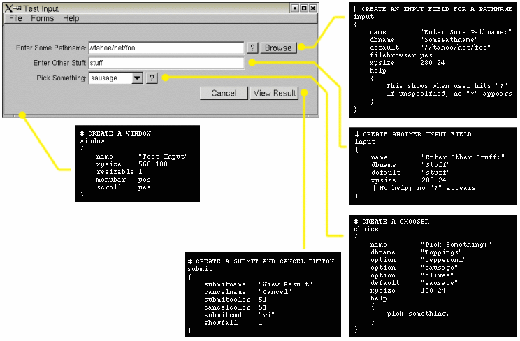
| Fig 1. Example program can be found in rush/examples/input-example.pl. |
|
|
| Fig 1. Example program can be found in rush/examples/input-example.pl. |
Simply put, you give 'input' a gui description file (using the commands documented below) to layout the data entry screen. eg:
input -d description_file.in
Input will present the screen to the user,
let them enter data, the when the user hits the 'Submit' button, 'input' will write
out a small text file with the user's data entries; a file of key/value pairs, one for
each field in the user's form.
There are many examples that come with rush. The simplest is 'input-example.pl', which you can easily try out and read. It comes in the $RUSH_DIR/examples directory in rush versions 102.31n and up.
What follows is an index of the GUI description file commands..
Commands
Reference Tables |
This is disabled by default.
Use this to define a window that should not be show by
default when the application is run. The window can be
told to open later by hitting a button
whose winshow window index is set to
this window.
HelpFor is used to pre-define helptext for the InputString
and InputFilename commands. This allows one to define
the help text in a higher section of the file, away from the definition of the
input fields, to prevent clutter.
Example:
InputString is a new (102.31n+) shortcut way to define input fields
using a single line, instead of the multiline Input
commands.
This command uses the current XY value for the position,
and the current XYSize for the size of the input field.
Example:
InputFilename is a new (102.31n+) shortcut way to define filename
prompts using a single line, instead of the multiline Input
commands with the filebrowser enabled.
(New in 102.31p)
See the 'input' command's filebrowserfilter
for the possible wildcard character strings that can be specified for the filter.
This command uses the current XY value for the position,
and the current XYSize for the size of the input field.
The filebrowser button is enabled, so the user can select filenames.
Example:
InputMultiline is a new (102.31n+) shortcut way to define multiline
string prompts using a single line definition, instead of the
longer Input specification with 'multiline' enabled.
This command uses the current XY value for the position,
and the current XYSize for the size of the input field.
The 'multiline' option is enabled, so that several lines of input can be specified
by the user.
If an 'apphelp' document has been defined, then a help
button is automatically created, and linked to the global 'apphelp' using the
'dbname' field as the link.
Example:
Multiple filters can be specified. Examples:
"text" may contain environment variables (which are expanded before
being displayed), eg.
When the button is hit, these things happen:
The program's output will be displayed in a pop up window
if showfail 1 is configured for the button,
and the command returns a non-zero exit code.
Similar to system "text", which does not absorb
the program's output, and simply invokes the system(2)
C library call.
Command must be quoted.
When the button is hit, these things happen:
The program's output will be displayed in a pop up window
if showfail 1 is configured for the button,
and the command returns a non-zero exit code.
Command must be quoted.
When the button is hit, these things happen:
Controls how the system command is executed.
'flags' must be quoted. 'flags' is a combination of one or
more letter flags shown below. If unspecified, the default
behavior is:
'flags' is a combination of one or more of these single letter
flags:
Here are some examples:
If {x} and {y} are zero, the box fits exactly the size of the text,
otherwise these values are added to the width and height of the box,
eg. width += x; height += y;
When the button is hit, these things happen:
The program's output will be displayed in a pop up window
if showfail 1 is configured for the button,
and the command returns a non-zero exit code.
Command must be quoted.
When a widget is defined, it automatically increments the 'Y' value
so that the next defined widget will appear directly below it, with
3 pixels of space in between.
If a widget defines its own xysize, the global value is unchanged.
Window
window
{
    name      "A GUI Interface"
    xysize    720 486
    color     46
    scroll
    resizable
}
Every input file must at least have one window definition.
For each window defined, it encompasses all widgets defined below it.
Commands that can appear within a window block:
color {val}
Sets the window background color,
according to this Color Map Chart.
The default color is 49, the FLTK default 'widget gray'.
hide {val}
(New in 102.31m+)
Opens the window in a 'hidden' state if value is 1.
menubar
(New in 102.31+)
Creates a menu bar that lets the user Load and Save the input
form.
name "text"
Sets the name of the window, eg. the title bar of the application.
When the window is stowed, this name usually shows on the stow
icon as well. The text must be quoted.
resizable
Enables the window to be resizable. By default, the window
is not resizable, and remains the fixed size set by xysize.
scroll
Enables a scroll bar, so that widgets placed offscreen can be
scrolled to by the user.
HelpFor
Don't use this if you're using the newer HTML oriented AppHelp
technique.
    helpfor "SceneFilename"
    {
        Enter the scene filename. Must be an absolute path.
	Use UNC paths when possible to avoid cross platform issues.
    }
    :
    inputfilename "Scene Filename" "SceneFilename" "//foo/bar"
    :
InputString
inputstring "Prompt Text" "Dbase-Name" "Default Text"
    apphelp
    {
    :
        <A NAME="RenderOpts">
	<H1>Render Options</H1>
	HTML Documentation on the Render Options field goes here..
	:
    }
    :
    xy 100 100
    xysize 320 24
    :
    inputstring "Render Options" "RenderOpts" ""
    :
InputFilename
inputfilename "Prompt Text" "Dbase-Name" "Default Text" ["Filter"]
The "Filter" is optional. If unspecified, all files are shown in browser.
If specified, only files matching the wildcard filter will be shown in the
browser (unless the user hits the 'All Files' button).
    apphelp
    {
    :
        <A NAME="SceneFilename">
	<H1>Scene Filename</H1>
	HTML Documentation on the Scene Filename field goes here..
	:
    }
    :
    xy 100 100
    xysize 320 24
    :
    inputfilename "Scene Filename" "SceneFilename" "//foo/bar" "*.scn"
    :
InputMultiline
inputmultiline "Prompt Text" "Dbase-Name" "Default Text"
    apphelp
    {
    :
        <A NAME="Cpus">
	<H1>Cpus</H1>
	HTML Documentation on the Cpus field goes here..
	:
    }
    :
    xy 100 100
    xysize 320 24
    :
    inputmultiline "Cpus" "Cpus" ""
    :
Input
input
{
    name         "Job Title"
    labelsize    14
    dbname       "JobTitle"
    default      "TEST_${USER}"
    xysize       280 24
    helpfontface 13
    helpfontsize 14
    help
    {
        The title for your job, which shows up
        in the job reports and audit logs.
    }
}
Input prompts allow the user to enter single or multiline text.
name "text"
Sets the name of the input prompt, as shown on the screen
to the left of the input window. Text must be quoted.
Use labelfont and/or labelsize to change the font.
dbname "text"
Sets the 'database name' for this input widget.
This name will appear in the temporary file created which contains
key/value pairs; the 'key' will be the dbname specified here,
the value will be the text entered in the input widget.
filebrowser {yes|no}
Enables a file browser button to appear next to the input widget,
so the user can bring up a file browser on the filename currently
in the input box.
filebrowserfilter "*.foo"
(New in 102.31p)
Sets the filter applied when files are shown in the browser.
Filter string must be quoted. The following syntax can be used
in the filter string (quoting the FLTK 1.1.0b11 documentation):
apphelp on
Creates a help button that links to the global AppHelp
defined for the application. The 'dbname' is used as the link to global apphelp.
So if the 'dbname' for this field is XXX, then the global apphelp should have
a link name defined as <A NAME="XXX"> so when the user clicks the help
button, this part of the document will be displayed.
default "text"
Sets the default text for the input field. Note; this will
be overridden by any settings in the 'input datafile',
specified on the commandline as 'input -f datafile'.
default "The home variable is set to ${HOME}"
To embed literal characters, such as '$', use '\' to escape the
character, eg. '\${HOME}' will prevent the expansion of the variable,
using the literal text '${HOME}'.
multiline
Enables multiple lines to be entered by the user, such as paragraphs
of text. It's recommended you also use xysize or xywh
to make the widget large enough for the user to type multiple lines.
align {val}
Sets the alignment of the name text. Values can be added
together. See the align value table.
labelfont {val}
Sets the font used by name.
See the font table for available fonts.
labelsize {val}
Sets the size of the font used by name in pixels.
Or maybe it's points. Whatever. Be happy you can see any text at all.
helpfontface {val}
Sets the font used in help popups defined by help.
See the font table for available fonts.
helpfontsize {val}
Sets the size of the font used in help popups.
textfont {val}
(New in 102.31m+)
Sets the font used by the input field.
See the font table for available fonts.
textsize {val}
(New in 102.31m+)
Sets the size of the font used by the input field pixels.
Or maybe it's points. Whatever. Be happy you can see any text at all.
xy {x} {y}
Sets absolute x/y positions for the lower left corner of the widget.
Does not affect xysize (eg. doesn't affect width or height).
xysize {w} {h}
Sets the pixel size of the widget. Does not affect the current
'default' position of the widget.
xywh {x} {y} {w} {h}
Sets absolute position and size of widget.
color {val}
Sets the background color of the input box, according to this
Color Map Chart. The default color is white.
Button
button
{
    name        "Stop"
    xysize      100 30
    system      "rsh how 'echo STOP > /dev/console'"
    color       9
}
Input prompts allow the user to enter single or multiline text.
name "text"
Sets the name that shows up on the button.
Use labelfont and/or labelsize to change the font.
Text must be quoted.
labelcolor {val}
Sets the color for the name text.
See this color value chart for available colors.
The default color is black.
labelfont {val}
Sets the font used by name.
See the Font Types for available fonts.
The default font is 0, Helvetica.
labelsize {val}
Sets the size of the font used by name in pixels.
Or points. Whatever.
color {val}
Sets the background color of the button, according to this
Color Map Chart. The default color is 49.
command "the_command"
Sets the command that's executed when the button is hit.
updatecommand "the_command"
Useful for having a button cause a procedural modification
to the data in the current form.
The program should use the INPUT_DBASE environment variable
to determine the filename of the saved form file, which it
can load, modify, and rewrite.
system "the_command"
Sets the command that's executed when the button is hit.
Differs from command in that the command's output is
simply sent to stdout/stderr. Command must be quoted.
Under Microsoft Windows, a console window is opened
for "the_command" to run in.
systemflags "flags"
Microsoft Windows only; under Unix these flags are ignored.
c Create a console window
m creates console window minimized
b background the process (don't wait)
s stdio inheritance (default off)
e exec; don't run commands in a 'cmd' shell
systemflags ""
No console window is opened.
The main program blocks until the program finishes
executing.
Command is run in a CMD shell.
systemflags "c"
A console window is opened.
The main program blocks until the program
finishes executing.
Command is run in a CMD shell.
systemflags "cm"
A console window is opened minimized.
The main program blocks until the program
finishes executing.
Command is run in a CMD shell.
systemflags "b"
No console is opened.
The command is run in the background;
the main program does not wait.
Command is run in a CMD shell.
winhide {window_index}
(New in 102.31m+)
Sets the window index for the window to be closed when you hit this button.
So if you define two windows, 'winclose 0' will hide the first one,
'winclose 1' will close the second one. This is useful to have a button
close the one of the defined windows, usually the current one.
winshow {window_index}
(New in 102.31m+)
Sets the window index for the window to be opened when you hit this button.
So if you define two windows, 'winopen 0' will open the first one,
'winopen 1' will open the second one. This is useful to have a button
open another defined window. It usually works best if the window to
be opened was defined with its hide flag enabled.
xy {x} {y}
Sets absolute x/y positions for the lower left corner of the widget.
Does not affect xysize (eg. doesn't affect width or height).
xysize {w} {h}
Sets the pixel size of the widget. Does not affect the current
'default' position of the widget.
xywh {x} {y} {w} {h}
Sets absolute position and size of widget.
Boxes
box
{
    name      "Submit Maya"
    labelsize 36
    align     0
    type      0
    labeltype 4
    labelfont 0
    xysize    600 30
    color     52
    boxaround 0 0
}
Let you create boxes of color, and/or place short
text strings into your GUI, such as title headings
and comments.
name "text"
Sets the text displayed in the box.
align {value}
Sets the alignment of the text. The value can be
logically ORed values from the Alignment Types.
type {value}
Sets the type of box. See the Box Types
for more info. Default is a transparent box, type 0 (FL_NOBOX).
color {val}
Sets the background color of the box, according to this
Color Map Chart.
The default color is 49.
Note: if the box is transparent (default), it will have no color.
boxaround {x} {y}
Causes the box to adjust itself to the text string set by 'name "text"'.
labelfont {val}
Sets the font used by name.
See the Font Types for available fonts.
The default font is 0, Helvetica.
labeltype {val}
See this Label Types
for the label types.
labelsize {val}
Sets the size of the font used by name in pixels.
Or maybe it's points. Whatever. Be happy you can see text at all.
labelcolor {val}
Sets the background color of the 'name "text"' string,
according to this Color Map Chart.
The default color is 0 (black).
helpfontface {val}
Sets the font used in help popups defined by help.
See the font table for available fonts.
helpfontsize {val}
Sets the size of the font used in help popups.
xy {x} {y}
Sets absolute x/y positions for the lower left corner of the box.
Does not affect xysize (eg. doesn't affect width or height).
xysize {w} {h}
Sets the initial size (width and height) of the box.
If unspecified, the box default size is based on the global xysize value.
Does not affect the current 'default' position of the box.
xywh {x} {y} {w} {h}
Sets absolute position and size of box.
Choice
choice
{
    name      "Make Logdir?"
    dbname    "MakeLogdir"
    labelsize 14
    option    "yes"
    option    "no"
    xysize    100 24
    helpfontface 4
    helpfontsize 14
    help
    {
	Should the logdir be created if one is set,
	but doesn't already exist?

	    yes   # Create the log directory if not already there
	    no    # No, don't create the log directory
    }
}
Creates a 'pulldown' menu chooser that lets the user
select from a list of choices. The chosen item is saved into
the key/value file; the text of the chooser is used as the 'value'.
name "text"
Sets the text displayed next to the chooser, based on
the 'align' value.
align {value}
Sets the alignment of the text. The value can be
logically OR-ed values from the Alignment Types.
type {value}
Sets the type of chooser. Um, I'm not sure what these values do
in this context. Try it and see.
color {val}
Sets the background color of the chooser
according to this Color Map Chart.
The default color is 49.
labelfont {val}
Sets the font used by name.
See the Font Types for available fonts.
The default font is 0, Helvetica.
labeltype {val}
See this Label Types
for the label types.
labelsize {val}
Sets the size of the font used by name in pixels.
Or maybe it's points. Whatever. Be happy you can see text at all.
labelcolor {val}
Sets the background color of the 'name "text"' string,
according to this Color Map Chart.
The default color is 0 (black).
apphelp on
Creates a help button that links to the global AppHelp
defined for the application. The 'dbname' is used as the link to global apphelp.
So if the 'dbname' for this field is XXX, then the global apphelp should have
a link name defined as <A NAME="XXX"> so when the user clicks the help
button, this part of the document will be displayed.
helpfontface {val}
Sets the font used in help popups defined by help.
See the font table for available fonts.
helpfontsize {val}
Sets the size of the font used in help popups.
textfont {val}
(New in 102.31m+)
Sets the font used by the chooser popup.
See the font table for available fonts.
textsize {val}
(New in 102.31m+)
Sets the size of the font used by the chooser popip in pixels.
Or maybe it's points. Whatever. Be happy you can see any text at all.
xy {x} {y}
Sets absolute x/y positions for the lower left corner of the chooser.
Does not affect xysize (eg. doesn't affect width or height).
xysize {w} {h}
Sets the initial size (width and height) of the chooser.
If unspecified, the chooser default size is based on the global xysize value.
Does not affect the current 'default' position of the chooser.
xywh {x} {y} {w} {h}
Sets absolute position and size of chooser.
option "text"
Adds an option to the chooser.
"text" is what is shown in the chooser, and is put
into the key/value file if the user chooses it.
default "text"
Sets which 'option "text"' is the default.
If unset, the first 'option "text"' is the default.
dbname "name"
Sets the 'database name' for the chooser.
This name will appear in the temporary file created which contains
key/value pairs; the 'key' will be the dbname specified here,
the value will be the text entered in the input widget.
Submit
submit
{
    submitname   "Submit"
    cancelname   "Cancel"
    submitcolor  51
    cancelcolor  51
    submitcmd    "myprogram -submit"
    showfail     1
}
Creates the 'submit' and 'cancel' buttons that are usually common
to all submission based forms.
apphelp on
Creates a help button that links to the global AppHelp
defined for the application. Jumps to the first page of the document.
cancelname "string"
The text displayed inside the 'Cancel' button.
Normally "Cancel", but it can be anything you want.
cancelcolor {val}
The color of the 'Cancel' button
according to this Color Map Chart.
The default color is 48.
exitok {0|1}
If 'exitok' is set to 1, and the command exits successfully (with a return
value of 0), the main program will exit.
helpcolor {val}
The color of the 'Help' button
according to this Color Map Chart.
The default color is 48.
helpname "string"
Sets the text in the help button.
By default, this is "?".
helpfontface {val}
Sets the font used in help popups defined by help.
See the font table for available fonts.
helpfontsize {val}
Sets the size of the font used in help popups.
labelfont {val}
Sets the font used by name.
See the font table for available fonts.
labelsize {val}
Sets the size of the font used by name in pixels.
Or maybe it's points. Whatever. Be happy you can see text at all.
submitcmd "command"
The 'submitcmd' is the name of the program executed
when the user hits the button.
submitcolor {val}
The color of the 'Submit' button
according to this Color Map Chart.
The default color is 48.
submitname "string"
The text displayed inside the 'Submit' button.
Normally "Submit", but it can be anything you want.
showfail {0|1}
If 'showfail' is 1, and the command returns a non-zero exit code,
the program's output will be displayed in a pop up window, indicating
the failure and exit code.
AppHelp
apphelp
{
   ..html text..
}
Defines html help documentation for the application. This text
can be made available to the user in two ways;
XY
Sets the default X and Y positions for the next widget defined.
Widgets will use the 'xy' values specified in the global context
if the widget doesn't define its own xy position.
XYSize
Sets the global default X/Y size of the next widget defined.
Widgets will use the 'xysize' values specified in the global context
if the widget doesn't define its own xysize.
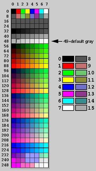
Color Map
The following color conversion chart shows what color values are..
Font Types
The following font conversion chart shows what labelfont values are..
Value Font Face 0 Helvetica 1 Helvetica Bold 2 Helvetica Italic 3 Helvetica Bold/Italic 4 Courier 5 Courier Bold 6 Courier Italic 7 Courier Bold/Italic 8 Times 9 Times Bold 10 Times Italic 11 Times Bold/Italic 12 Symbol 13 Screen 14 Screen Bold 15 Dingbats
Alignment Types
The following alignment value table shows how align controls
alignment of text around or inside widgets. Values can be added together
to make combos. For instance, to get text to left justify INSIDE a box,
use 20 (16+4).
Value Description 0 Center 1 Top 2 Bottom 4 Left 8 Right 16 Inside 32 Unused 64 Clip 128 Wrap
Label Types
The following value table shows what kinds of text labels
are available. The default is usually 'FL_NORMAL_LABEL', which
means the plain font. Don't use any of the image oriented label
types; they're not supported (yet).
Value Description 0 FL_NORMAL_LABEL 1 FL_NO_LABEL 2 _FL_SYMBOL_LABEL 3 _FL_SHADOW_LABEL 4 _FL_ENGRAVED_LABEL 5 _FL_EMBOSSED_LABEL 6 _FL_BITMAP_LABEL 7 _FL_PIXMAP_LABEL 8 _FL_IMAGE_LABEL 9 _FL_MULTI_LABEL
Box Types
The following are 'box types' used to set the kind of box
displayed in 'box' commands.
Value Description 0 FL_NO_BOX 1 FL_FLAT_BOX 2 FL_UP_BOX 3 FL_DOWN_BOX 4 FL_UP_FRAME 5 FL_DOWN_FRAME 6 FL_THIN_UP_BOX 7 FL_THIN_DOWN_BOX 8 FL_THIN_UP_FRAME 9 FL_THIN_DOWN_FRAME 10 FL_ENGRAVED_BOX 11 FL_EMBOSSED_BOX 12 FL_ENGRAVED_FRAME 13 FL_EMBOSSED_FRAME 14 FL_BORDER_BOX 15 _FL_SHADOW_BOX 16 FL_BORDER_FRAME 17 _FL_SHADOW_FRAME 18 _FL_ROUNDED_BOX 19 _FL_RSHADOW_BOX 20 _FL_ROUNDED_FRAME 21 _FL_RFLAT_BOX 22 _FL_ROUND_UP_BOX 23 _FL_ROUND_DOWN_BOX 24 _FL_DIAMOND_UP_BOX 25 _FL_DIAMOND_DOWN_BOX 26 _FL_OVAL_BOX 27 _FL_OSHADOW_BOX 28 _FL_OVAL_FRAME 29 _FL_OFLAT_BOX