RUSH RENDER QUEUE
(C) Copyright 1995,2000 Greg Ercolano. All rights reserved.
V 102.40f05/06/03


  Input  

    This document describes the 'input' program that comes with the Rush Render Queue. 'input' is used to allow scripts (Perl, Csh, etc) to present a simple GUI interface for user data entry.

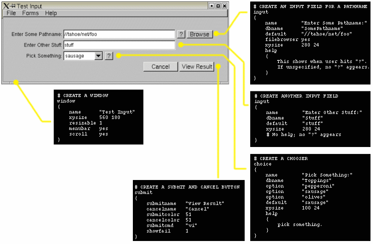
    Fig 1. Example program can be found in rush/examples/input-example.pl.

    Simply put, you give 'input' a gui description file (using the commands documented below) to layout the data entry screen. eg:

    	input -d description_file.in
        
    Input will present the screen to the user, let them enter data, the when the user hits the 'Submit' button, 'input' will write out a small text file with the user's data entries; a file of key/value pairs, one for each field in the user's form.

    There are many examples that come with rush. The simplest is 'input-example.pl', which you can easily try out and read. It comes in the $RUSH_DIR/examples directory in rush versions 102.31n and up.

    What follows is an index of the individual GUI description file commands.


   AppHelp  
    apphelp
    {
       ..html text..
    }
    
    Defines html help documentation for the application. This text can be made available to the user in two ways;

    • If 'apphelp on' is defined for Submit, it enables a "Help" button to be created next to 'Cancel' in the Submit command, which the user can hit to jump to the top of the AppHelp document.

    • If any input fields has 'apphelp on' defined, and no "help" defined. This will create a "?" button which the user can hit to jump into the document. The input field's "dbname" will be used as the link to jump to. So if the dbname for the field is XXX, the HTML document should contain <A NAME="XXX"> for the help button to link to the HTML text properly.

   Box  

   Button  

   Choice  

   HelpColor  
    Sets the default color for all help buttons, eg. "?" and "Help" buttons.

   HelpFor  
    Don't use this if you're using the newer HTML oriented AppHelp technique.

    HelpFor is used to pre-define helptext for the InputString and InputFilename commands. This allows one to define the help text in a higher section of the file, away from the definition of the input fields, to prevent clutter. Example:

        helpfor "SceneFilename"
        {
            Enter the scene filename. Must be an absolute path.
    	Use UNC paths when possible to avoid cross platform issues.
        }
        :
        inputfilename "Scene Filename" "SceneFilename" "//foo/bar"
        :
    

   InputString  
    inputstring "Prompt Text" "Dbase-Name" "Default Text"

    InputString is a new (102.31n+) shortcut way to define input fields using a single line, instead of the multiline Input commands.

    This command uses the current XY value for the position, and the current XYSize for the size of the input field.

    Example:

        apphelp
        {
        :
            <A NAME="RenderOpts">
    	<H1>Render Options</H1>
    	HTML Documentation on the Render Options field goes here..
    	:
        }
        :
        xy 100 100
        xysize 320 24
        :
        inputstring "Render Options" "RenderOpts" ""
        :
        

   InputFilename  
    inputfilename "Prompt Text" "Dbase-Name" "Default Text" ["Filter"]

    InputFilename is a new (102.31n+) shortcut way to define filename prompts using a single line, instead of the multiline Input commands with the filebrowser enabled.

      The "Filter" is optional. If unspecified, all files are shown in browser. If specified, only files matching the wildcard filter will be shown in the browser (unless the user hits the 'All Files' button).

      See the 'input' command's filebrowserfilter for the possible wildcard character strings that can be specified for the filter.

    This command uses the current XY value for the position, and the current XYSize for the size of the input field. The filebrowser button is enabled, so the user can select filenames.

    Example:

        apphelp
        {
        :
            <A NAME="SceneFilename">
    	<H1>Scene Filename</H1>
    	HTML Documentation on the Scene Filename field goes here..
    	:
        }
        :
        xy 100 100
        xysize 320 24
        :
        inputfilename "Scene Filename" "SceneFilename" "//foo/bar" "*.scn"
        :
        

   InputMultiline  
    inputmultiline "Prompt Text" "Dbase-Name" "Default Text"

    InputMultiline is a new (102.31n+) shortcut way to define multiline string prompts using a single line definition, instead of the longer Input specification with 'multiline' enabled.

    This command uses the current XY value for the position, and the current XYSize for the size of the input field. The 'multiline' option is enabled, so that several lines of input can be specified by the user.

    If an 'apphelp' document has been defined, then a help button is automatically created, and linked to the global 'apphelp' using the 'dbname' field as the link.

    Example:

        apphelp
        {
        :
            <A NAME="Cpus">
    	<H1>Cpus</H1>
    	HTML Documentation on the Cpus field goes here..
    	:
        }
        :
        xy 100 100
        xysize 320 24
        :
        inputmultiline "Cpus" "Cpus" ""
        :
        

   Input  

   Submit  

   UsePlastic  
    (New in 102.40g+)
    Enables 'plastic' looking buttons throughout the application, as opposed to the default, square buttons. Has no arguments.

   Window  

   XY  
    Sets the default X and Y positions for the next widget defined. Widgets will use the 'xy' values specified in the global context if the widget doesn't define its own xy position.

    When a widget is defined, it automatically increments the 'Y' value so that the next defined widget will appear directly below it, with 3 pixels of space in between.

   XYSize  
    Sets the global default X/Y size of the next widget defined. Widgets will use the 'xysize' values specified in the global context if the widget doesn't define its own xysize.

    If a widget defines its own xysize, the global value is unchanged.


Tables


   Alignment Types  
    The following alignment value table shows how align controls alignment of text around or inside widgets. Values can be added together to make combos. For instance, to get text to left justify INSIDE a box, use 20 (16+4).

        Alignment Types
        0 Center
        1 Top
        2 Bottom
        4 Left
        8 Right
        16 Inside
        32 Unused
        64 Clip
        128 Wrap

   Box Types  
    The following are 'box types' used to set the kind of box displayed in 'box' commands.

        Box Types
        0 FL_NO_BOX
        1 FL_FLAT_BOX
        2 FL_UP_BOX
        3 FL_DOWN_BOX
        4 FL_UP_FRAME
        5 FL_DOWN_FRAME
        6 FL_THIN_UP_BOX
        7 FL_THIN_DOWN_BOX
        8 FL_THIN_UP_FRAME
        9 FL_THIN_DOWN_FRAME
        10 FL_ENGRAVED_BOX
        11 FL_EMBOSSED_BOX
        12 FL_ENGRAVED_FRAME
        13 FL_EMBOSSED_FRAME
        14 FL_BORDER_BOX
        15 FL_SHADOW_BOX
        16 FL_BORDER_FRAME
        17 FL_SHADOW_FRAME
        18 FL_ROUNDED_BOX
        19 FL_RSHADOW_BOX
        20 FL_ROUNDED_FRAME
        21 FL_RFLAT_BOX
        22 FL_ROUND_UP_BOX
        23 FL_ROUND_DOWN_BOX
        24 FL_DIAMOND_UP_BOX
        25 FL_DIAMOND_DOWN_BOX
        26 FL_OVAL_BOX
        27 FL_OSHADOW_BOX
        28 FL_OVAL_FRAME
        29 FL_OFLAT_BOX
        30 FL_PLASTIC_UP_BOX
        31 FL_PLASTIC_DOWN_BOX
        32 FL_PLASTIC_UP_FRAME
        33 FL_PLASTIC_DOWN_FRAME

   Color Map  
    The following color conversion chart shows what color values are..

   Font Types  
    The following font conversion chart shows what labelfont values are..

        Font Types
        0 Helvetica
        1 Helvetica Bold
        2 Helvetica Italic
        3 Helvetica Bold/Italic  
        4 Courier
        5 Courier Bold
        6 Courier Italic
        7 Courier Bold/Italic  
        8 Times
        9 Times Bold
        10 Times Italic
        11 Times Bold/Italic  
        12 Symbol
        13 Screen
        14 Screen Bold
        15 Dingbats

   Label Types  
    The following value table shows what kinds of text labels are available. The default is usually 'FL_NORMAL_LABEL', which means the plain font. Don't use any of the image oriented label types; they're not supported (yet).

        Label Types
        0 FL_NORMAL_LABEL
        1 FL_NO_LABEL
        2 _FL_SYMBOL_LABEL
        3 _FL_SHADOW_LABEL
        4 _FL_ENGRAVED_LABEL
        5 _FL_EMBOSSED_LABEL
        6 _FL_BITMAP_LABE
        7 _FL_PIXMAP_LABEL
        8 _FL_IMAGE_LABEL
        9 _FL_MULTI_LABEL