button
{
    name        "Stop"
    xysize      100 30
    system      "rsh how 'echo STOP > /dev/console'"
    color       9
}
Input prompts allow the user to enter single or multiline text.
name "text"
Sets the name that shows up on the button.
Use labelfont and/or labelsize to change the font.
Text must be quoted.
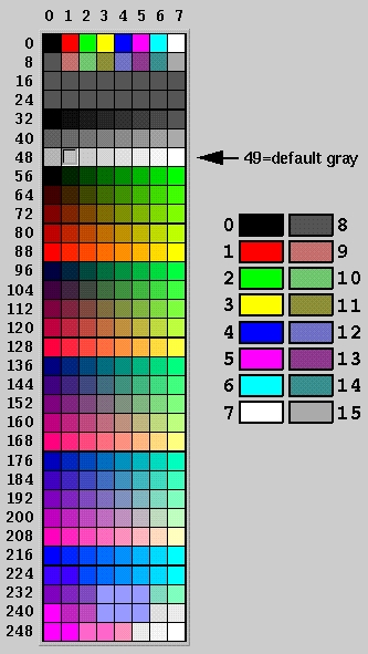
labelcolor {val}
Sets the color for the name text.
See this color value chart for available colors.
The default color is black.
Sets the font used by name.
See the Font Types for available fonts.
The default font is 0, Helvetica.
labelsize {val}
Sets the size of the font used by name in pixels.
Or points. Whatever.
Sets the type of box to use for the button in its 'down' position.
Must be one of the 'box names' defined under boxtypes,
eg. boxdown "FL_PLASTIC_DOWN_BOX"
Sets the type of box to use for the button in its 'up' position.
Must be one of the 'box names' defined under boxtypes,
eg. boxup "FL_PLASTIC_UP_BOX"
color {val}
pushcolor {val}
command "the_command"
Sets the command that's executed when the button is hit.
When the button is hit, these things happen:
- The current form is saved to a file
- The command is executed. It can use the INPUT_DBASE
environment variable to determine the filename of the
saved form, which the program can load (but not modify)
and act on.
The program's output will be displayed in a pop up window
if showfail 1 is configured for the button,
and the command returns a non-zero exit code.
Similar to system "text", which does not absorb
the program's output, and simply invokes the system(2)
C library call.
Command must be quoted.
updatecommand "the_command"
Useful for having a button cause a procedural modification
to the data in the current form.
When the button is hit, these things happen:
- The current form is saved to a file
- The 'command' program is executed.
The program should use the INPUT_DBASE environment variable
to determine the filename of the saved form file, which it
can load, modify, and rewrite.
- The (modified) form is then reloaded as the current form,
updating the screen with any mods applied by the program.
- (New in 102.42)
The tmp file is removed.
The program's output will be displayed in a pop up window
if showfail 1 is configured for the button,
and the command returns a non-zero exit code.
Command must be quoted.
system "the_command"
Sets the command that's executed when the button is hit.
Differs from command in that the command's output is
simply sent to stdout/stderr. Command must be quoted.
Under Microsoft Windows, a console window is opened
for "the_command" to run in.
When the button is hit, these things happen:
- The current form is saved to a file
- The command is executed. It can use the INPUT_DBASE
environment variable to determine the filename of the
saved form, which the program can load (but not modify)
and act on.
systemflags "flags"
winhide {window_index}
Sets the window index for the window to be closed when you hit this button.
So if you define two windows, 'winhide 0' will hide the first one,
'winhide 1' will close the second one. This is useful to have a button
close the one of the defined windows, usually the current one.
winshow {window_index}
Sets the window index for the window to be opened when you hit this button.
So if you define two windows, 'winshow 0' will open the first one,
'winshow 1' will open the second one. This is useful to have a button
open another defined window. It usually works best if the window to
be opened was defined with its hide flag enabled.
xy {x} {y}
Sets absolute x/y positions for the lower left corner of the widget.
Does not affect xysize (eg. doesn't affect width or height).
xysize {w} {h}
Sets the pixel size of the widget. Does not affect the current
'default' position of the widget.
xywh {x} {y} {w} {h}
Sets absolute position and size of widget.
helpurl "/path/foo.html"
Shows the specified html document when button pressed.
Useful for "?" buttons that are supposed to open a help window
when button is pushed. (Overrides any 'system' or 'command's)
|